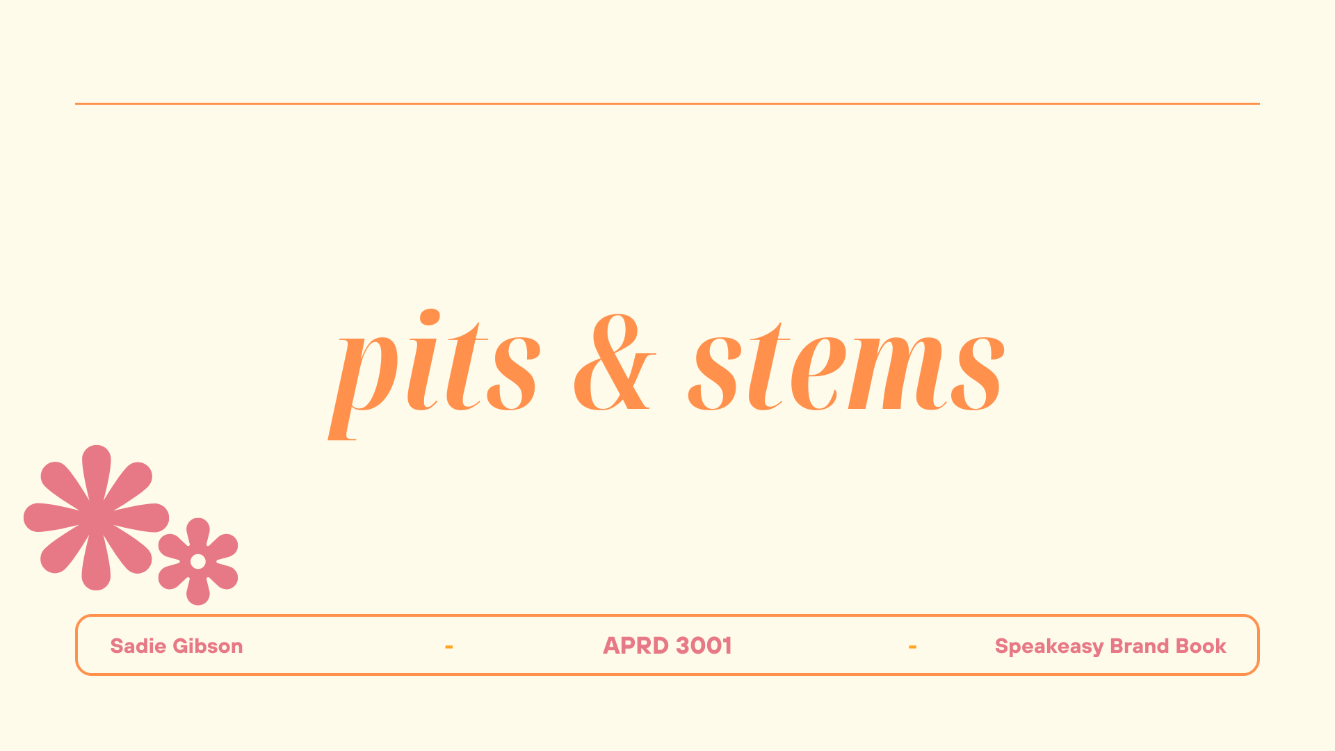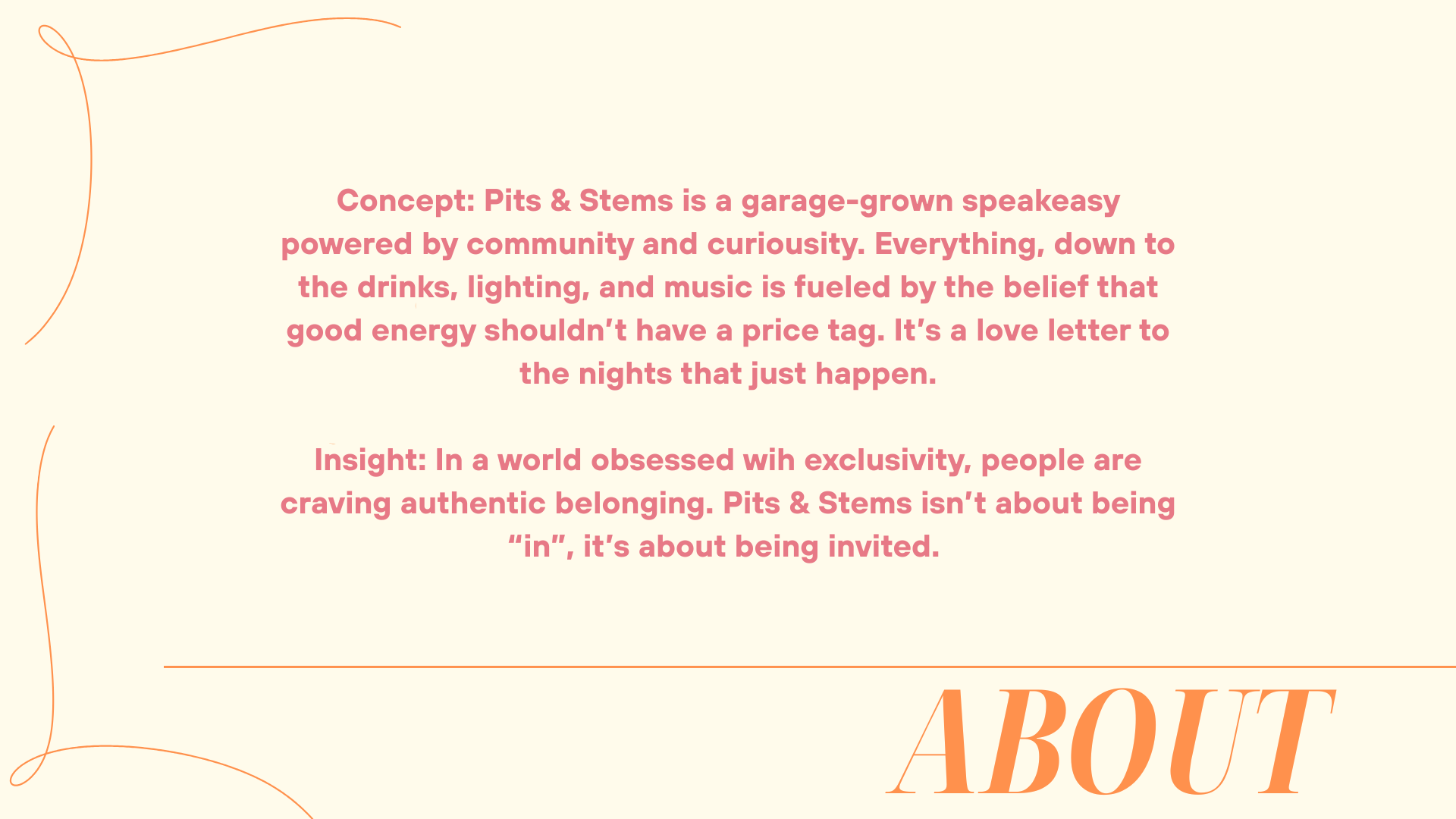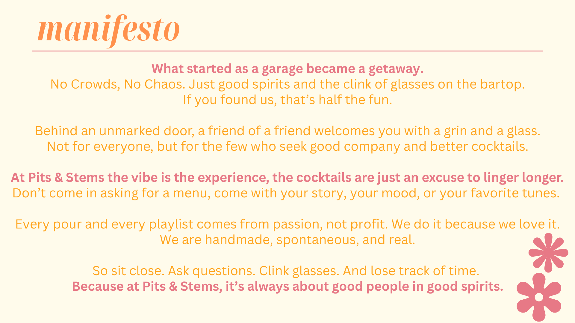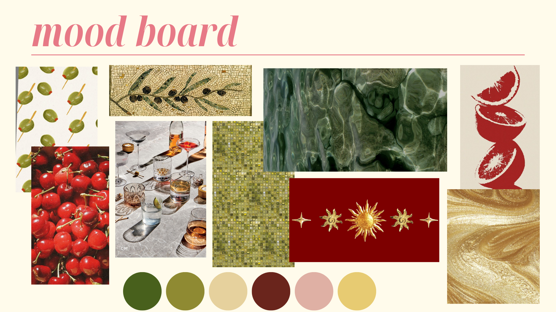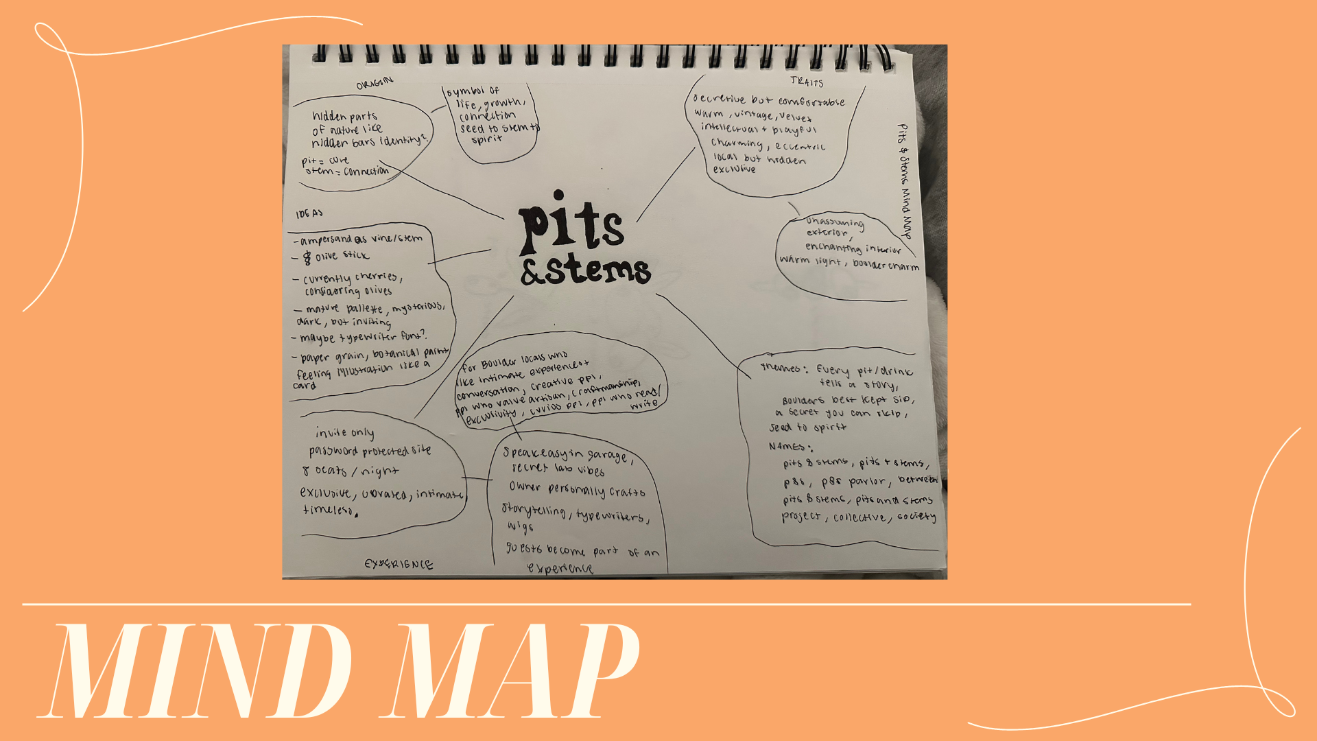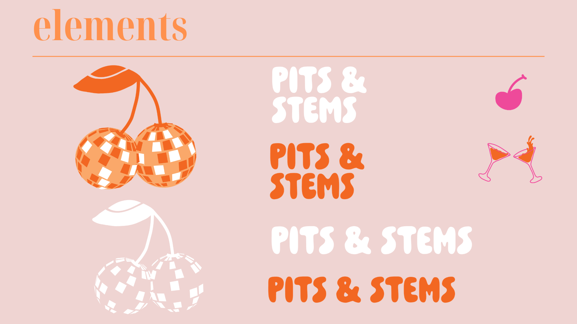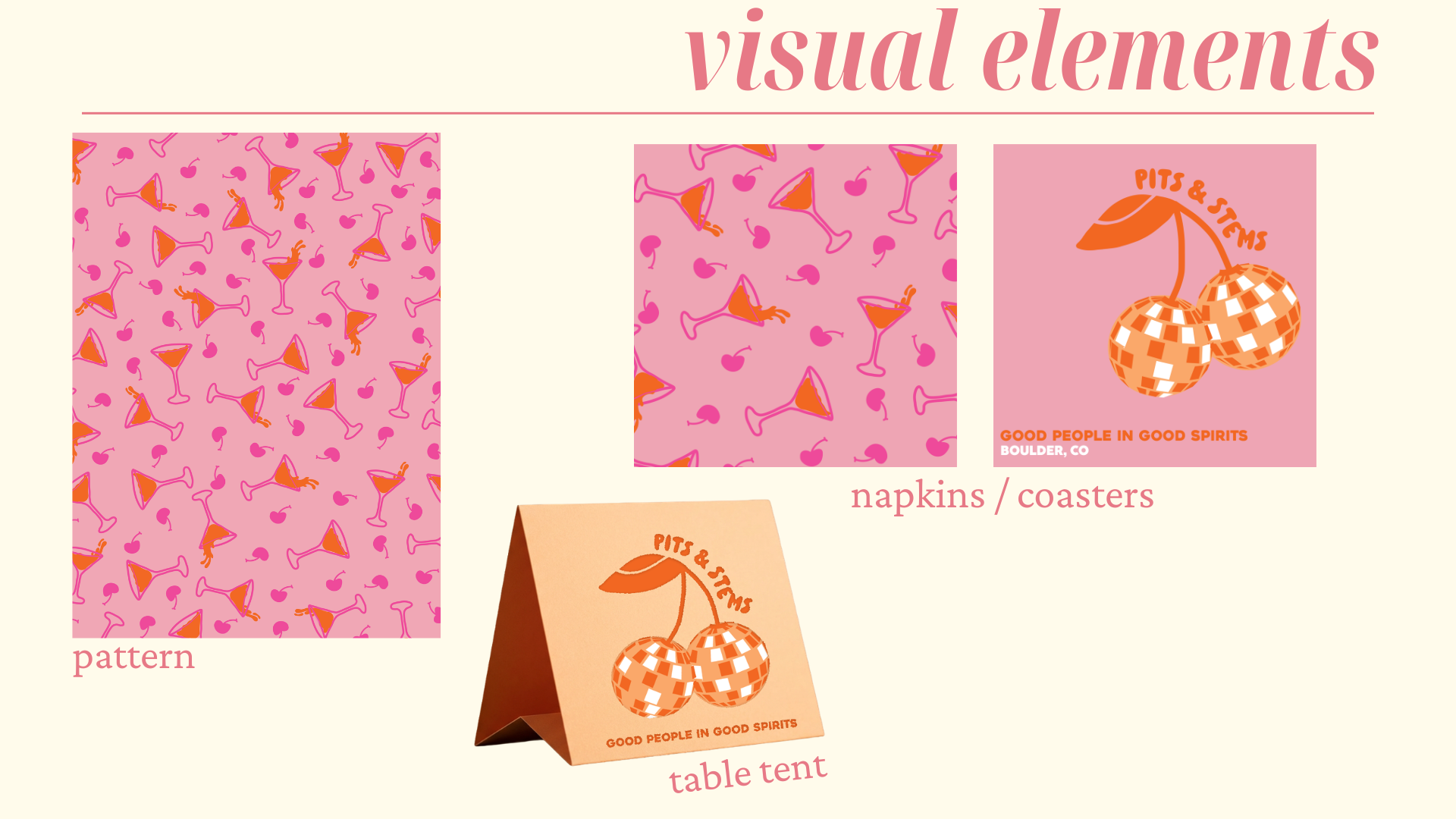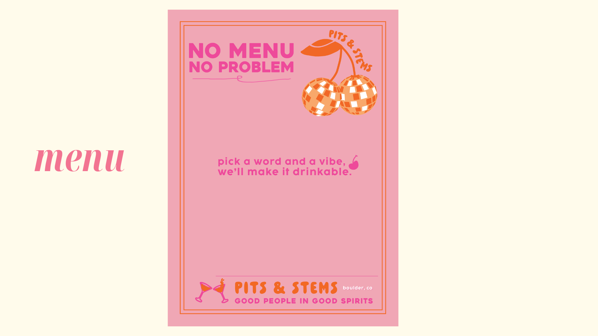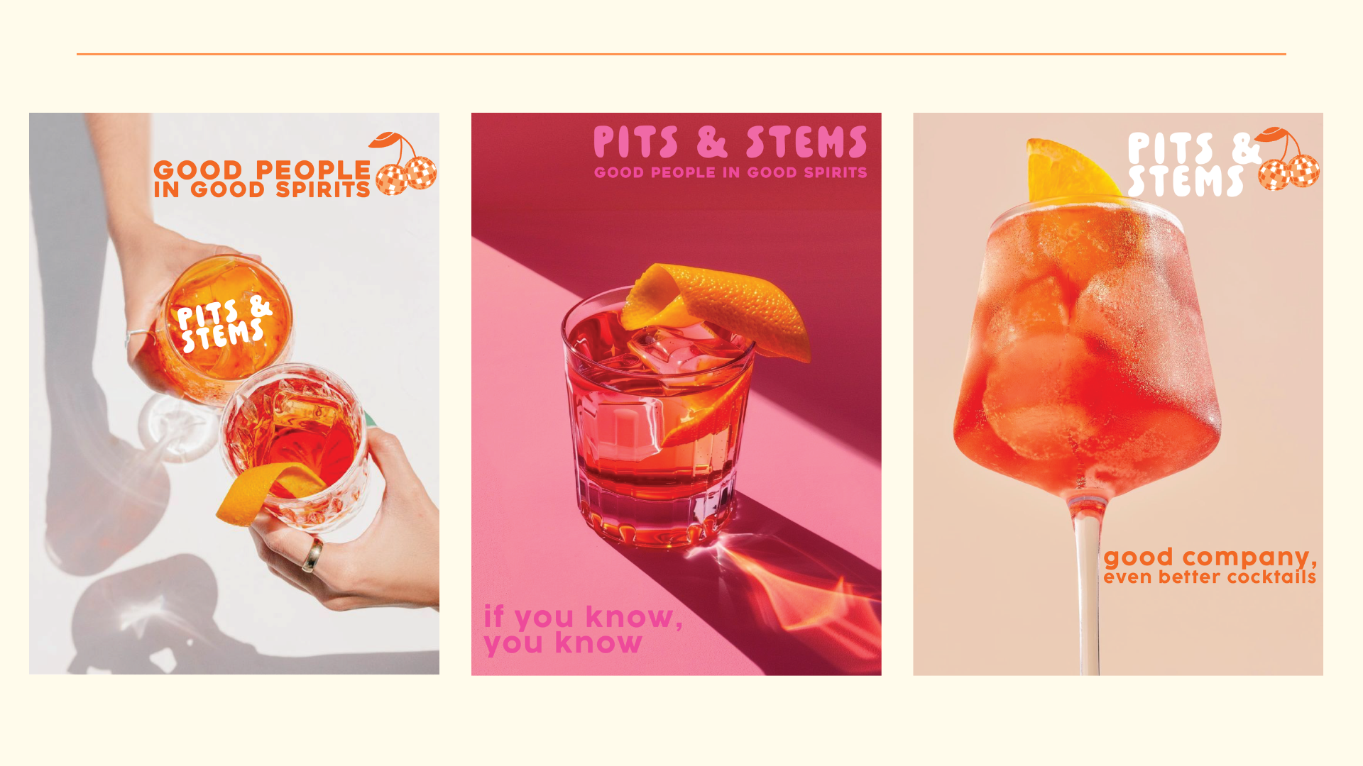
The client was looking for a refreshed logo, website, menus, napkins, and additional brand materials. From the project brief and client feedback, it was clear that maintaining the personality of the speakeasy was just as important as modernizing it. The ampersand, garnish, and signature orange color all held meaning for the owner, representing connection, joy, and beauty.
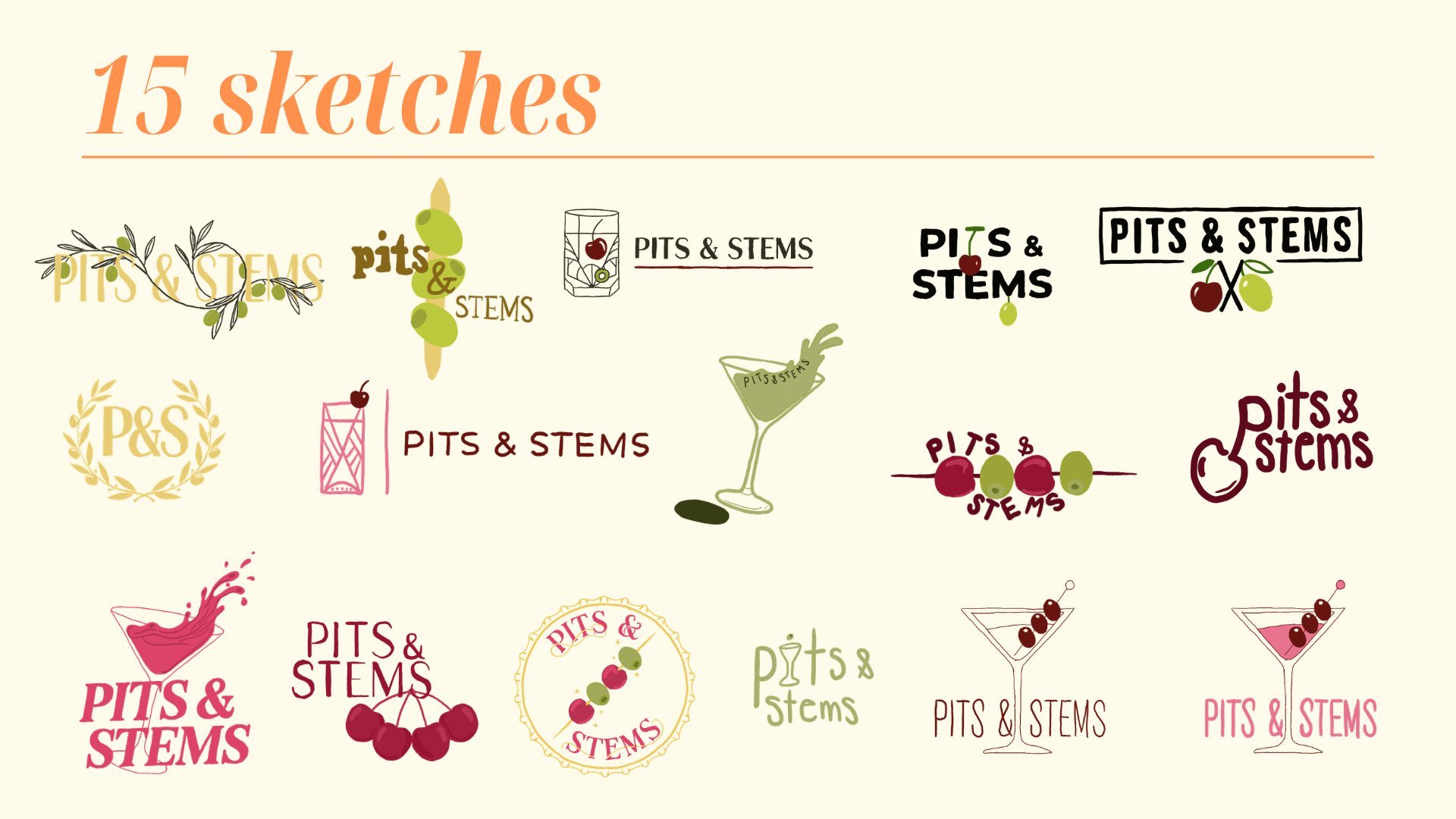
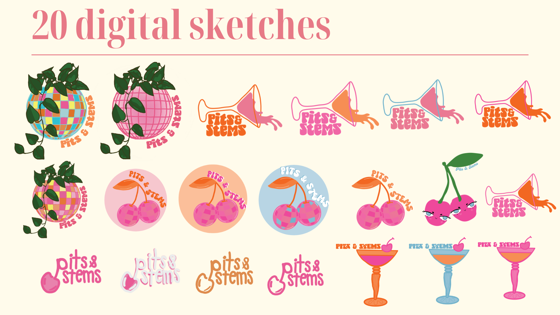
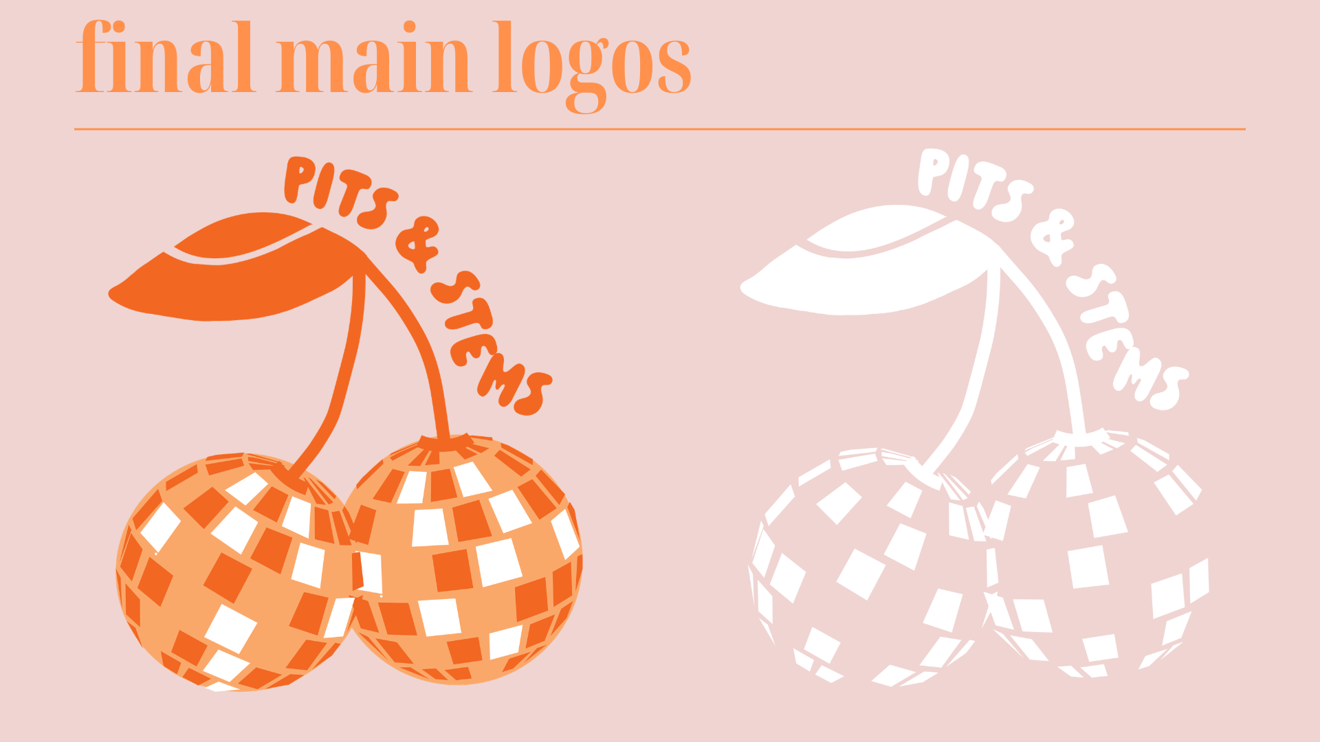
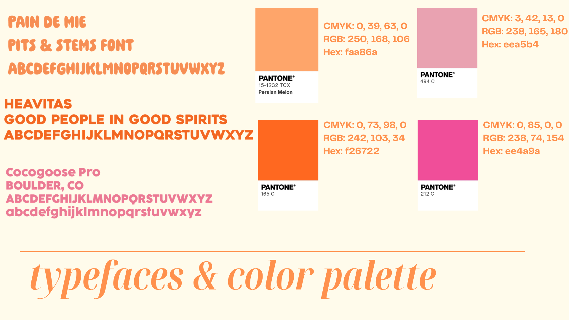
I loved the concept behind the original logo and wanted to preserve what made it recognizable while elevating it into something more refined. I found a typeface that closely reflected the character of the original branding and simplified the color palette to create a stronger, more cohesive identity.
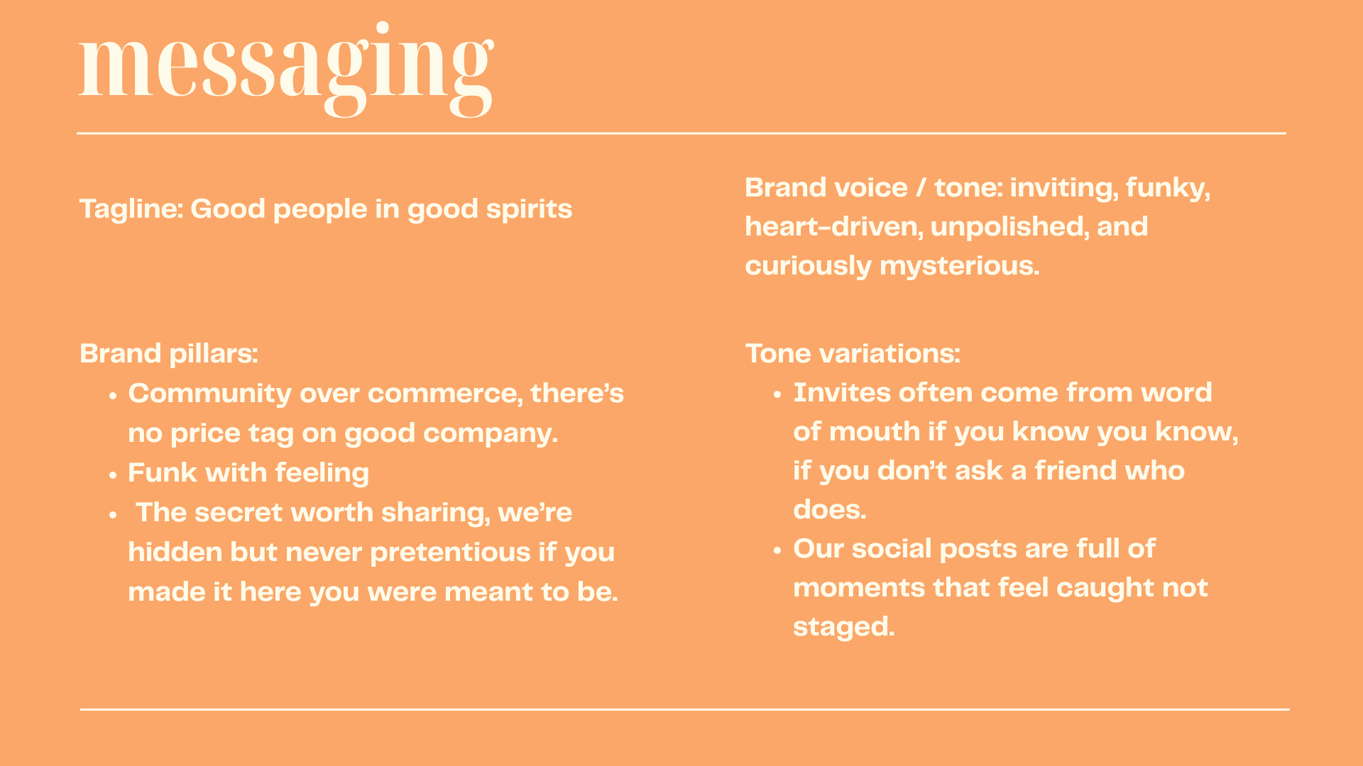
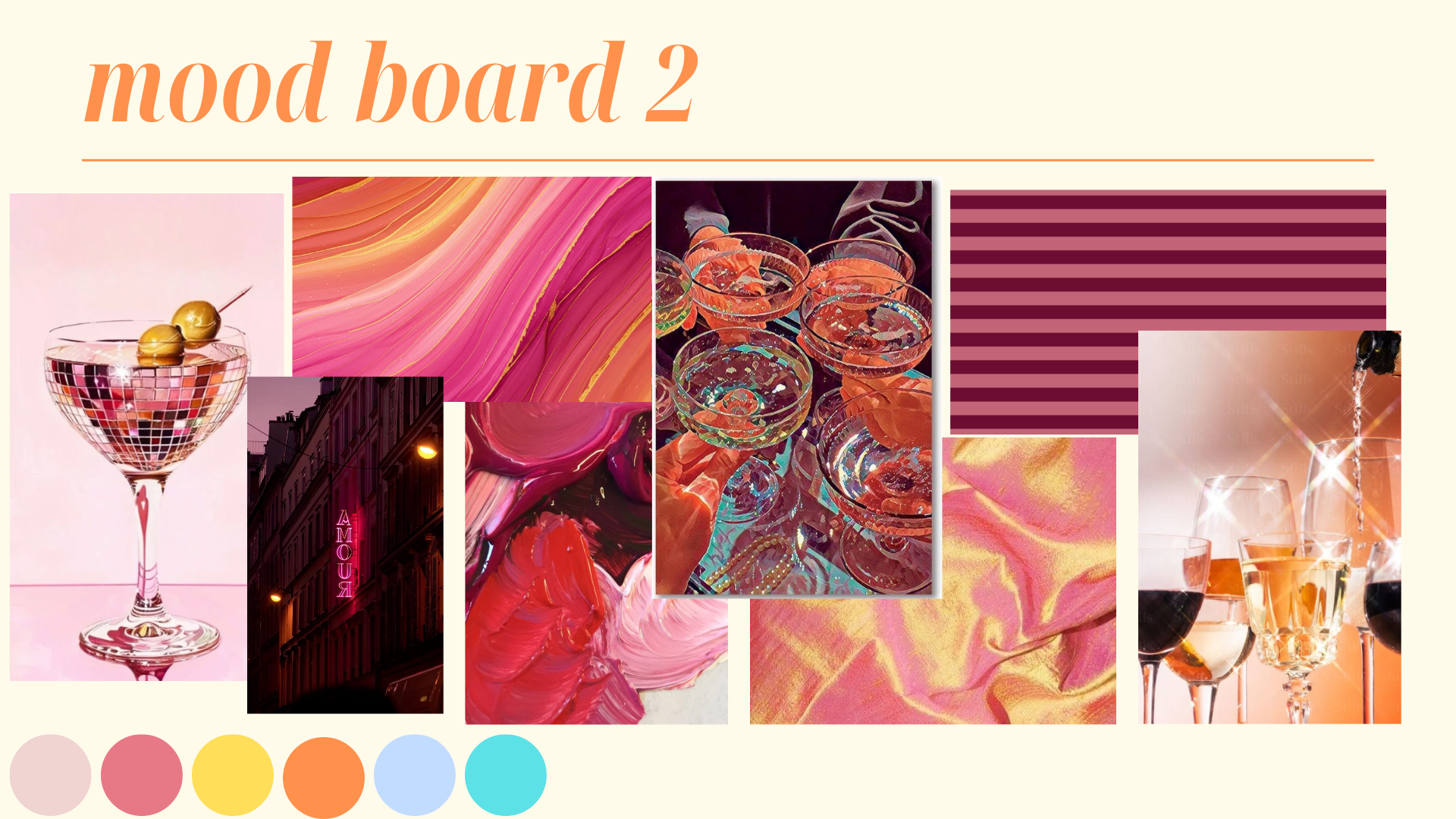
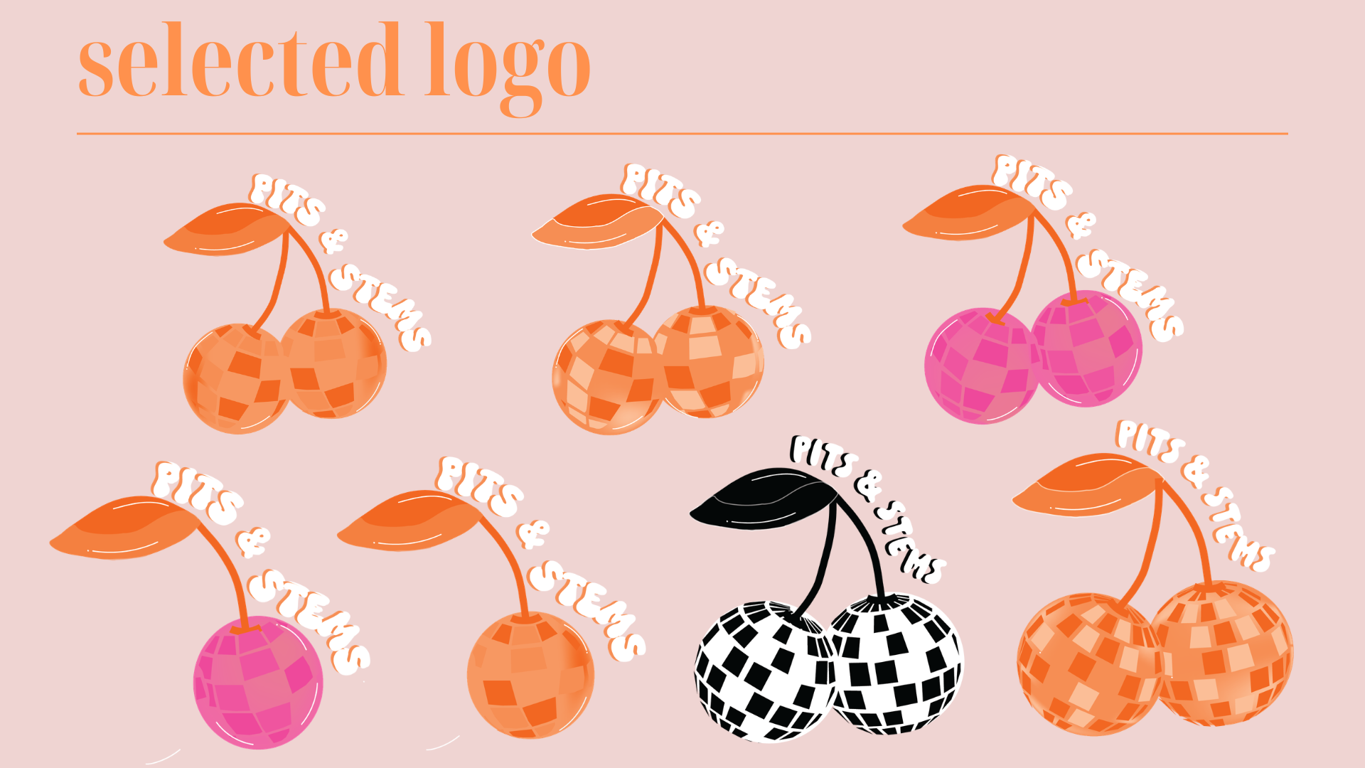
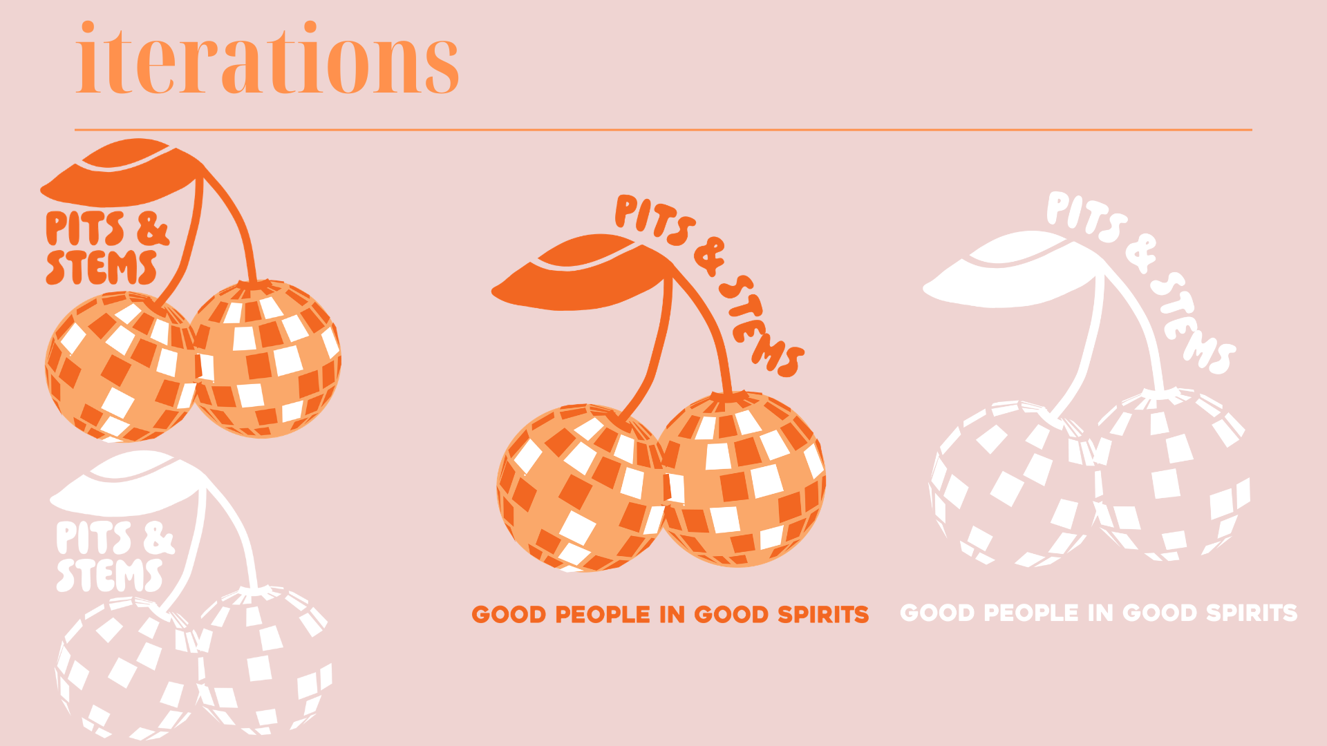
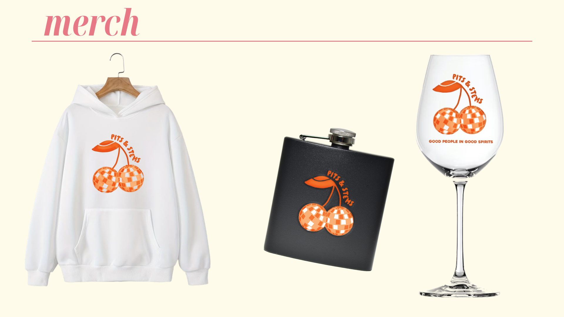
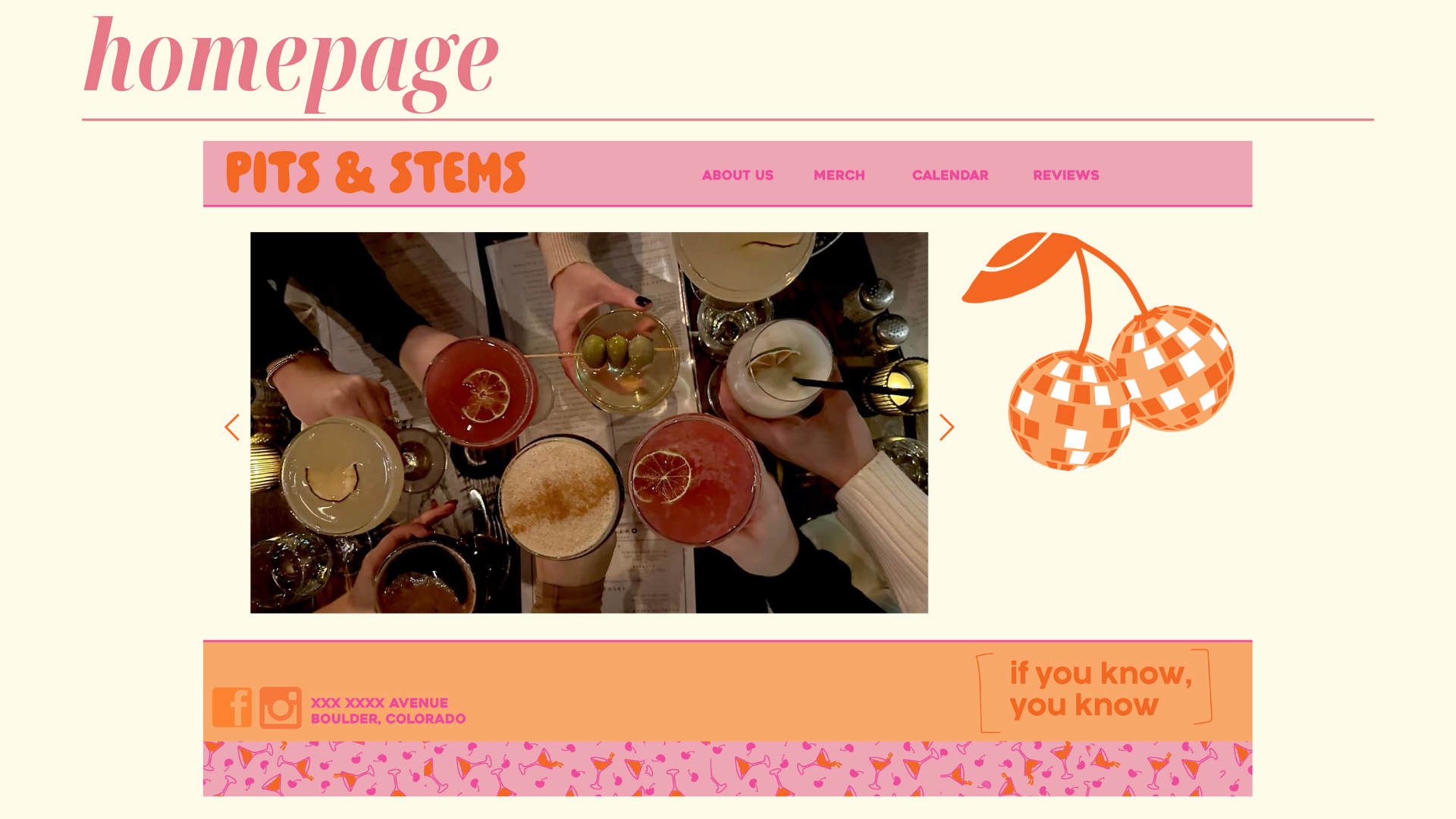
I kept the bright orange and pink tones because they captured the fun, welcoming atmosphere of the restaurant. Orange remained a key part of the brand not only because of its energy, but because it was a color the owner felt strongly connected to. From there, I extended the identity across menus, maps, a website, and supporting mockups to create a visual system that felt consistent while staying true to the restaurant's original charm.